For the Vancouver Recital Society’s 2026/27 season, Copilot developed a bold new visual direction inspired by the season theme, Great Escapes. A playful system of geometric forms and vibrant colour interacts with the artist photography, giving each performance its own character while creating a distinctive and cohesive identity across the season. The design extends across brochures, advertising, print and digital materials.
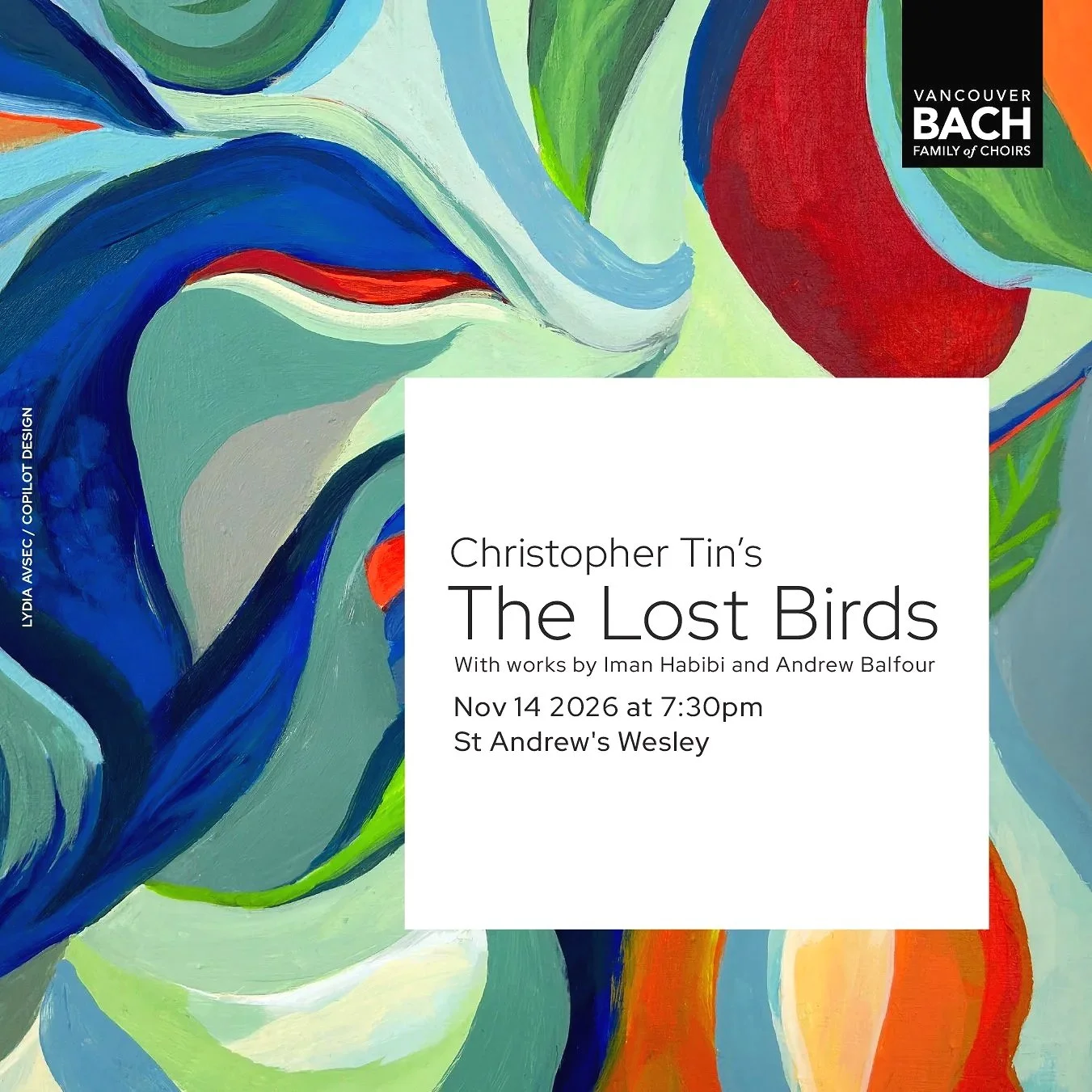
For the Vancouver Bach Family of Choirs’ 2026/27 season, Copilot created a series of original paintings inspired by the music, themes and character of each performance. Moving between expressive abstraction and more contemplative compositions, each piece was traditionally painted in gouache on illustration board before being developed into posters, advertising and digital materials.
Following an 18-month closure for major seismic upgrades, the Museum of Anthropology at UBC reopened its doors in 2024. Copilot developed a bold campaign celebrating both the return of this important cultural institution and the iconic architecture of MOA itself. The campaign extended across print, digital, transit shelters and buses, creating a highly visible presence throughout Vancouver and building anticipation for the museum’s reopening.
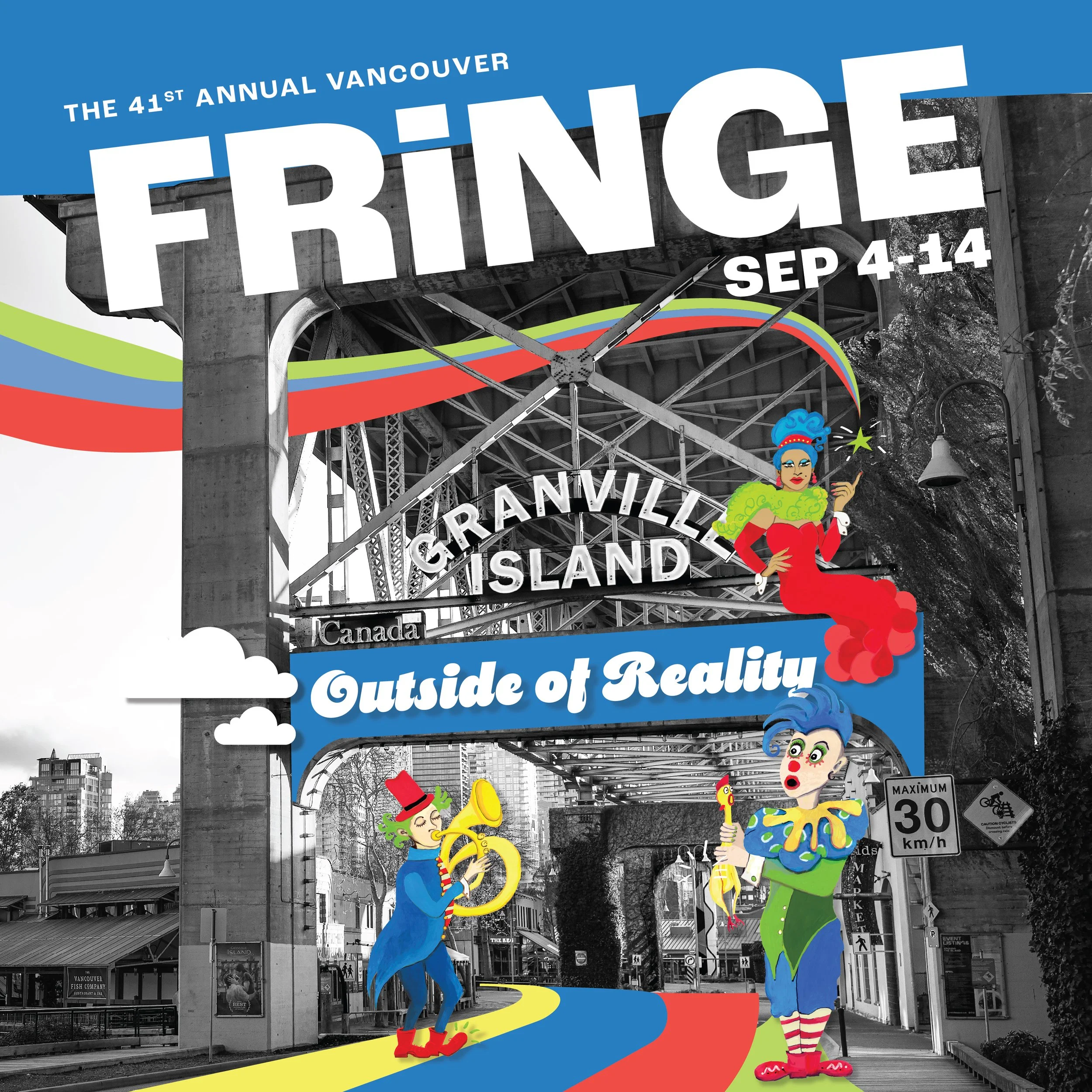
For the 2025 Vancouver Fringe Festival, Copilot created a whimsical cast of characters to capture the festival’s playful and unpredictable spirit. Bold colour, unexpected textures and quirky silhouettes form a flexible visual language that extends across transit advertising, print and digital materials. The result is a lively campaign designed to reflect the energy, experimentation and creative freedom at the heart of Fringe.
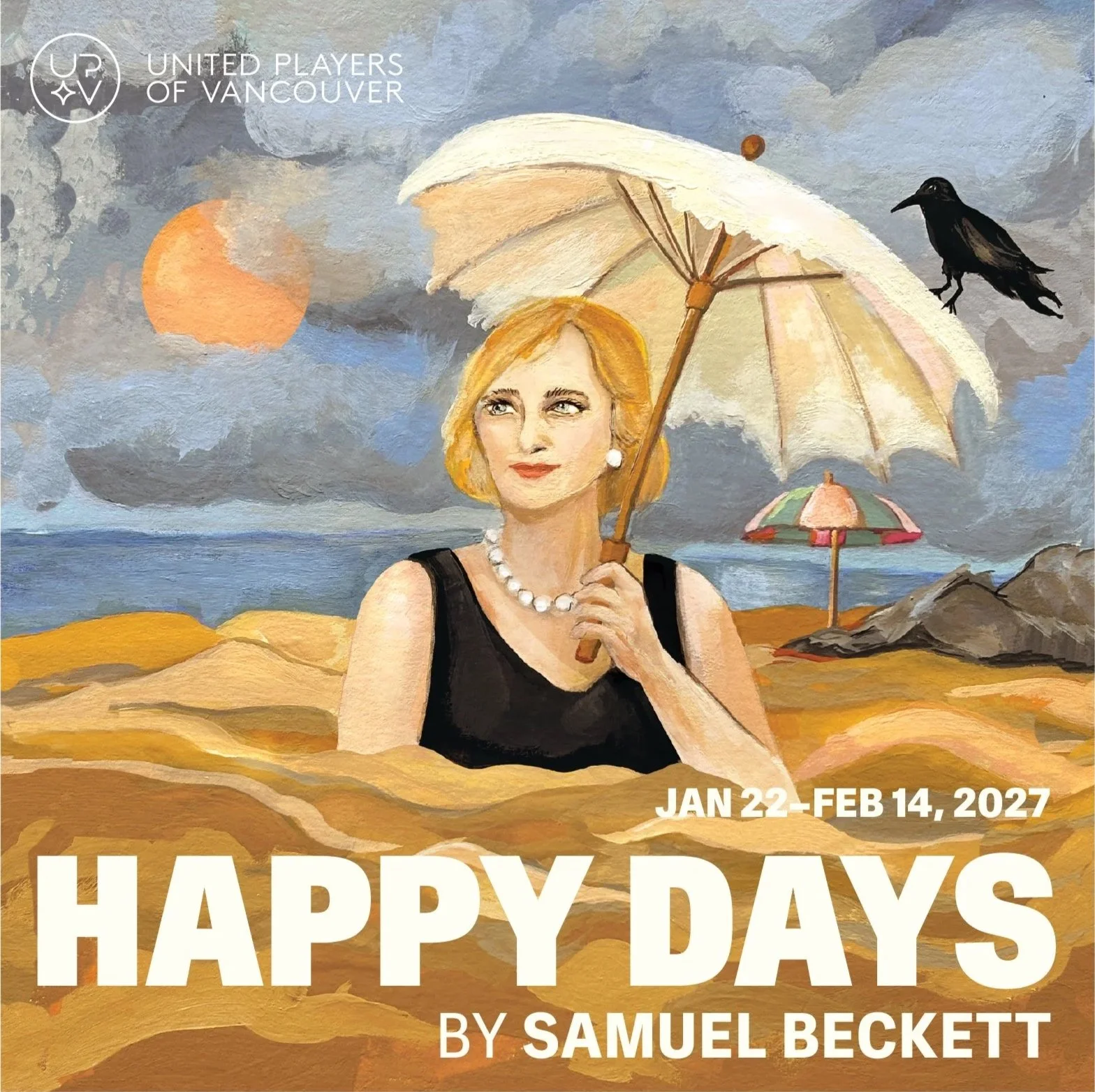
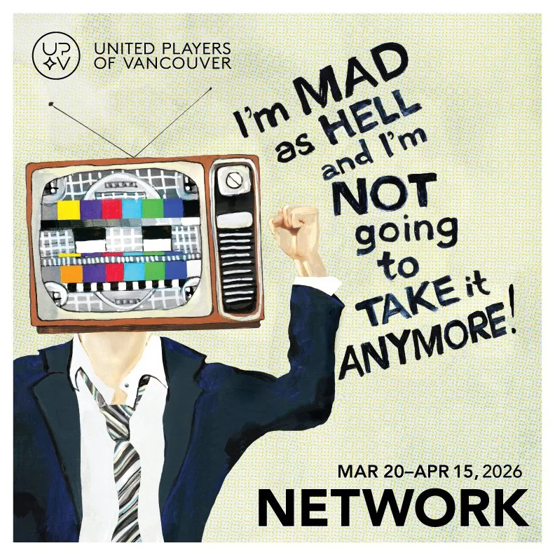
For United Players of Vancouver’s 2026/27 season, Copilot developed an original visual concept for each production in collaboration with each director. Each concept was brought to life through hand-painted illustration and design, capturing the distinct character, themes and atmosphere of the play while creating a cohesive visual presence across the season.
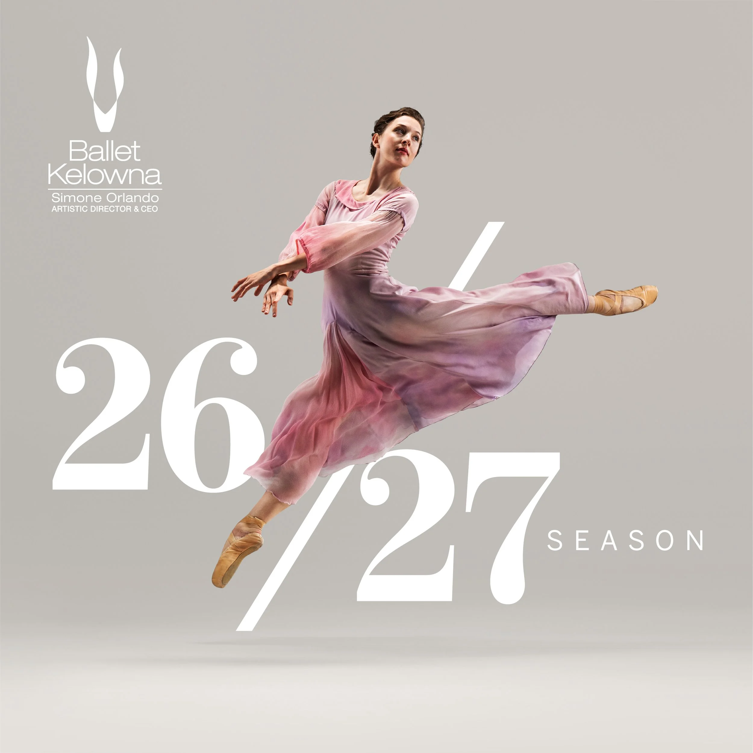
For Ballet Kelowna’s 2026/27 season, Copilot developed a refined visual direction built around expressive dance photography, elegant typography and a bold, evolving colour palette. A restrained season identity provides the foundation, while individual productions are distinguished through vivid colour and imagery, creating a flexible system that gives each performance its own character. The design extends across the season brochure, advertising, print and digital materials.
For the Vancouver Fringe Festival’s 40th anniversary, Copilot developed a striking visual campaign celebrating four decades of independent theatre and creative experimentation. Drawing inspiration from the festival’s history, a playful retro aesthetic brought new energy to the anniversary while retaining Fringe’s unconventional spirit. The campaign appeared throughout Vancouver and contributed to increased visibility, engagement and ticket sales for the milestone season.
The Vancouver Bach Family of Choirs wanted to refresh its identity while respecting its long musical tradition and reaching a broader contemporary audience. Copilot refined the logo, typography and signature red palette to create a warmer, more dynamic and versatile identity. The refreshed system improves clarity across print and digital applications while reflecting the collaboration, inclusivity and artistic excellence at the heart of the organization.
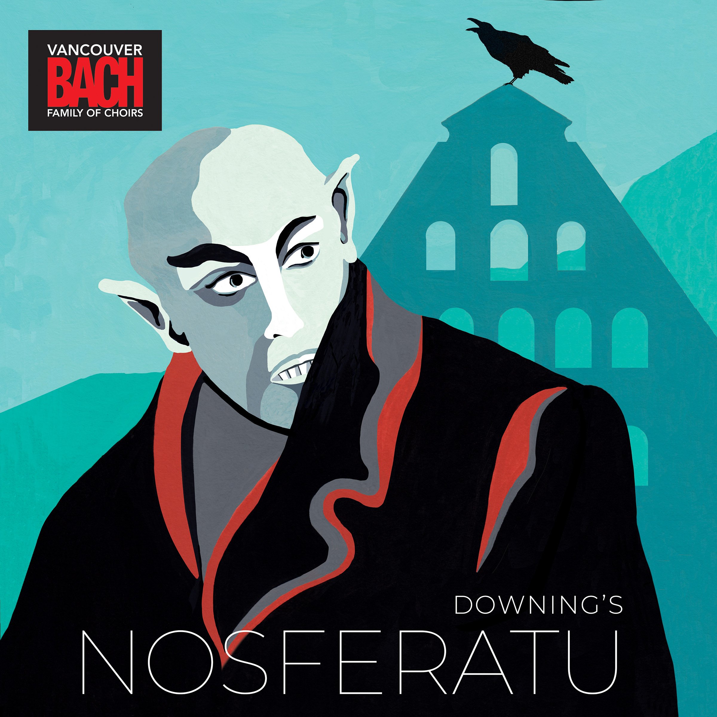
Over seven seasons, Copilot created an evolving body of work for the Vancouver Bach Family of Choirs. Each project begins with an original concept developed in response to the music and themes of the performance, then brought to life through hand-painted illustration and design. This approach gives each concert its own distinct visual character while maintaining continuity across the organization. The work spans season brochures, posters, advertising, transit and digital materials.
For Ballet Kelowna’s 2025/26 season, Copilot developed a bold visual direction combining expressive typography, vivid colour and layered dancer imagery. Silhouetted photography creates a sense of movement and interaction across the compositions, while a flexible graphic system unifies the season across brochures, advertising, print and digital materials.
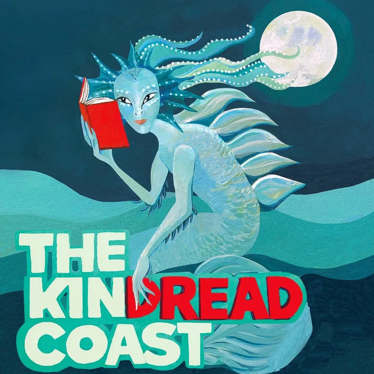
Copilot created the visual identity and ongoing cover series for Black Cat Books, an independent publisher founded by author Shanon Sinn. Beginning with the brand identity, the visual language has evolved across the West Coast Grimm anthology series, with each cover built around an original concept and hand-painted gouache illustration. Inspired by the supernatural stories and landscapes of British Columbia, the series combines folklore, nature and a slightly unsettling sense of whimsy.
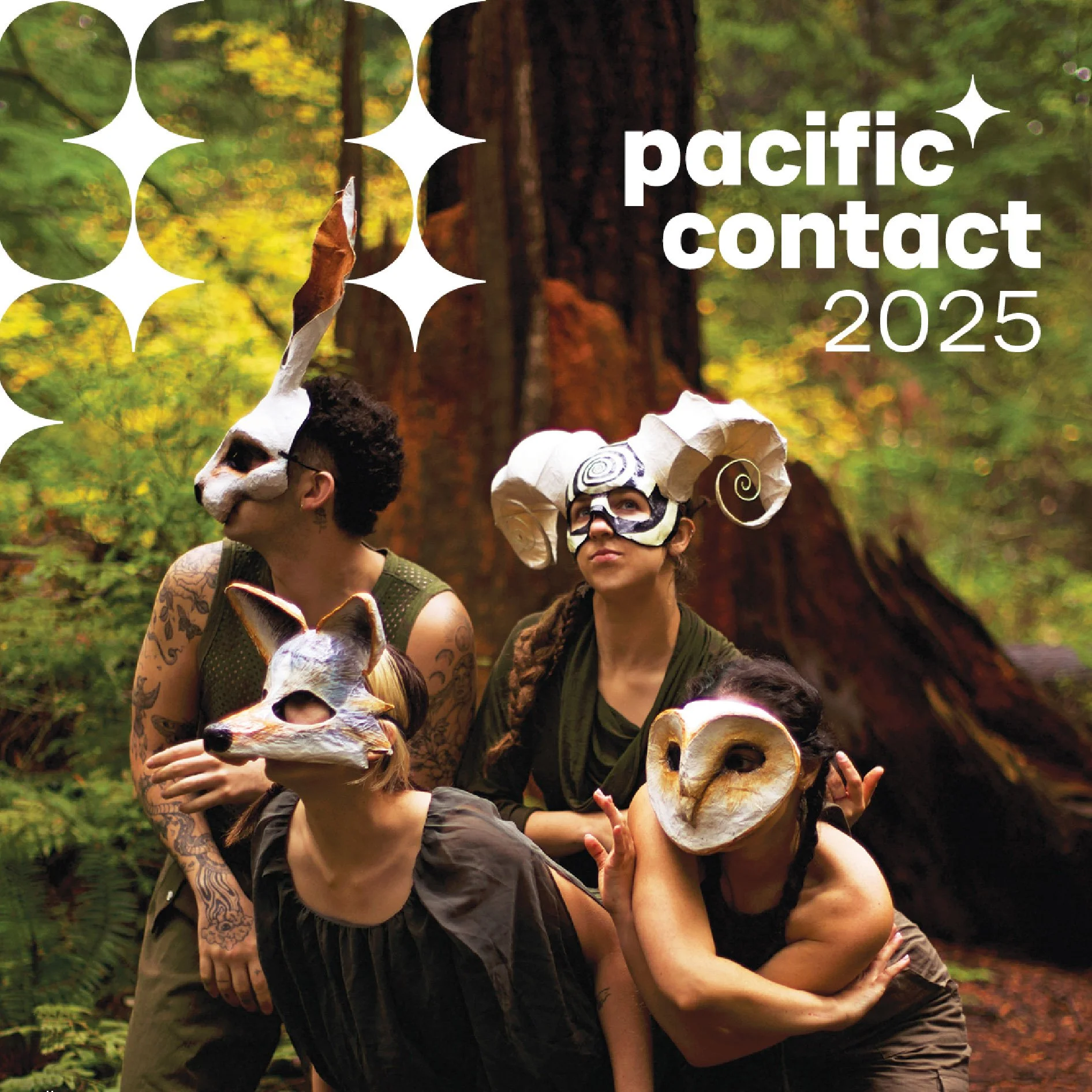
Working within BC Live’s existing branding, Copilot designed the visual materials for Pacific Contact 2025, selecting photography that captures the energy and diversity of live performance. The established graphic language was extended across the conference program, signage, digital communications and event materials, creating a cohesive and engaging presence throughout the event.
After three decades with its existing identity, the Vancouver Academy of Music was ready for a brand that reflected both its heritage and its future. Following extensive research and creative exploration, Copilot developed a contemporary identity that balances tradition with a sense of movement and possibility. The resulting system reflects VAM’s long-standing commitment to musical excellence while providing a flexible, recognizable identity across print and digital applications.
Over several seasons, Copilot has collaborated with United Players of Vancouver to create distinctive visual identities for a wide range of productions. Working with each production’s director, Copilot develops an original concept inspired by the themes, characters and atmosphere of the play, bringing it to life through hand-painted illustration and design. The resulting work gives each production its own visual character while creating a recognizable presence for United Players across posters, advertising, print and digital materials.
Opera Kelowna is a non-profit opera company presenting Canadian opera in the Okanagan. A flexible design system was needed for its three pillars: performance, education and community. Copilot developed a system using the ‘O’ of Opera Kelowna’s existing brand, with a unified colour palette and imagery unique to each pillar: a flowing scarf for performance, signifying excitement and movement; a paper airplane for community, suggesting outreach and connection; and blossoms for education, representing growth. The imagery within the ‘O’ can change while maintaining a consistent visual identity across the organization’s marketing materials.
For Gateway Theatre’s 40th anniversary, Copilot developed the visual direction for a milestone season celebrating four decades of storytelling and performance. Original concepts, illustration and expressive typography give each production its own personality while connecting the season through a cohesive visual language. The resulting campaign reflects the diversity, imagination and theatricality behind Gateway’s “Season of Stories.”
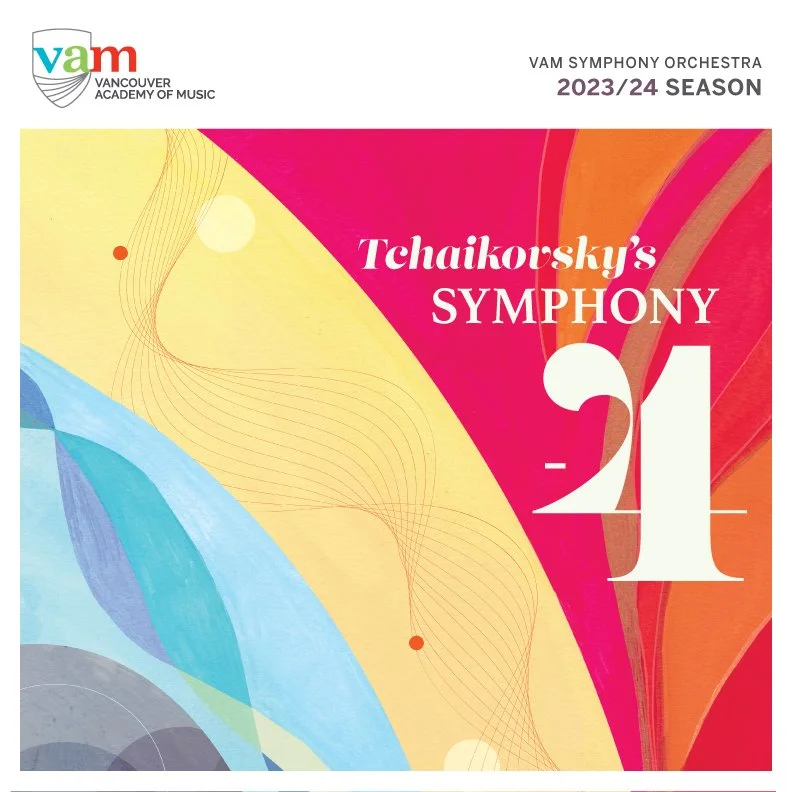
Over several seasons, Copilot developed original concepts, illustrations and poster design for the Vancouver Academy of Music Symphony Orchestra Series. Inspired by the music and themes of each concert, the work ranges from hand-painted gouache illustration to bold graphic compositions, giving each performance its own distinct visual identity. Together, the posters form an evolving series created for VAM’s orchestral performances.
Copilot worked with SFU Advancement and Alumni Engagement to develop a series of fundraising communications designed to connect with alumni and donors. The first campaign responded to the changing reality of student life during the pandemic, using an original concept to create an engaging and relatable message. Subsequent projects expanded the visual approach through hand-drawn illustration and design across print, digital and donor communications.
For 11 seasons, Copilot served as the sole graphic designer for the Chan Centre for the Performing Arts, developing the visual direction for its annual programming and communications. Working with an extraordinary roster of international artists, Copilot created season identities, brochures, posters, advertising and digital materials, with each season introducing a new visual approach while maintaining continuity with the Chan Centre brand. The collaboration evolved over more than a decade, culminating in the Chan Centre Dot Com Series before design moved in-house in 2022.
The Chan Centre for the Performing Arts needed to modernize and unify its existing identity while maintaining the recognition of its established brand. Copilot refined key elements of the original logo, introducing a more contemporary typographic treatment and streamlined visual system that aligned with UBC’s updated branding. The refreshed identity was developed into comprehensive brand guidelines and implemented across the Chan Centre’s print and digital communications.
Copilot developed a new visual identity for the Vancouver Recital Society, balancing the tradition and sophistication of classical music with a contemporary, approachable character. A bold colour palette, distinctive typography and flexible graphic system created a recognizable foundation for the brand across brochures, posters, advertising and digital communications. The identity went on to shape VRS’s visual presence for many seasons.
To celebrate the Peter Wall Institute for Advanced Studies’ 30th anniversary, Copilot designed a commemorative book documenting three decades of research, ideas and collaboration. The 28-page hardcover publication combines photography, typography and a restrained graphic system to create a contemporary editorial design that reflects the Institute’s identity. Produced in an 11 × 11-inch format with a blind-embossed hard cover, the book was designed as both a record of the Institute’s legacy and a lasting commemorative object.
To celebrate the Chan Centre’s 20th anniversary, Copilot developed a visual identity that marked the milestone while remaining connected to the established Chan Centre brand. Rather than focusing on any one performance, the anniversary materials celebrated the diversity and international scope of its programming through bold colour, photography and environmental graphics. The identity extended across banners, transit advertising, installations and a commemorative book documenting 20 years of the Chan Centre.
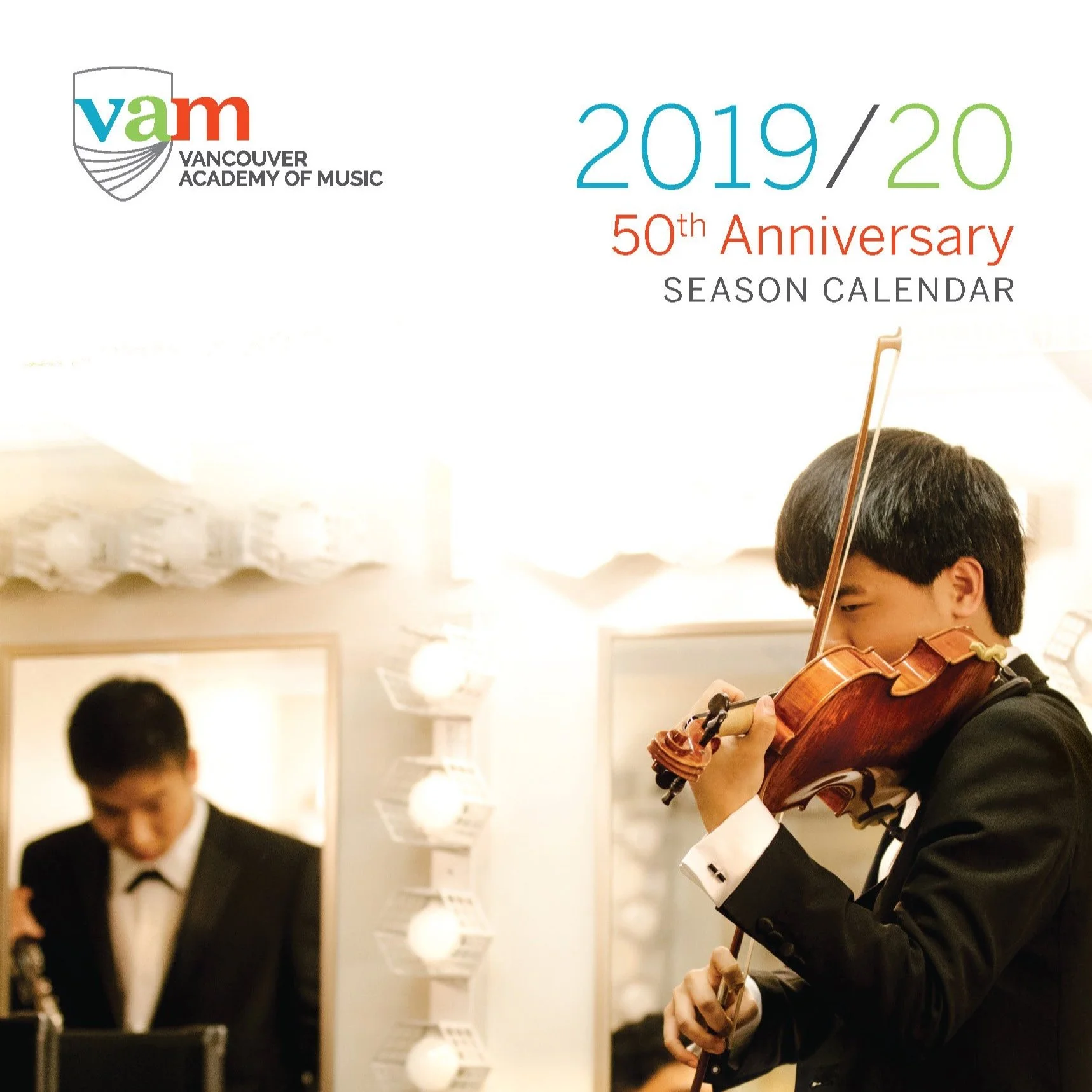
Across more than a decade, Copilot designed a range of brochures, season calendars and program materials for the Vancouver Academy of Music. Combining photography, illustration, typography and VAM’s established visual identity, each publication balances expressive design with clear organization of detailed program information. The work reflects an evolving approach across multiple seasons while maintaining a consistent and recognizable presence for the Academy.
Copilot created a series of original illustrations for street banners throughout downtown Sechelt, celebrating the landscape, wildlife and local history of the Sunshine Coast. Featuring imagery including ravens, salmon, coastal forests and the historic Lady Rose, the illustrations combine hand-painted imagery with vibrant colour to create a distinctive sense of place. The designs were adapted across a series of banners installed throughout the community.
Copilot created an original illustration celebrating the wildlife and natural environment of Sechelt, featuring bears and bees within a colourful West Coast landscape. Collaged textures, archival newspaper clippings and playful imagery reference the local community and its relationship to the surrounding environment. The artwork was adapted to wrap a public utility box, transforming an everyday streetscape object into a colourful piece of public art.
Over more than a decade, Copilot developed the visual direction for the Vancouver Recital Society’s annual seasons, building on the identity created for the organization in 2014. Each season introduced a fresh visual approach while maintaining a recognizable connection to the VRS brand, evolving from restrained black-and-white portraiture to increasingly expressive uses of colour, typography and photography.
The work spans season brochures, posters, advertising, transit, digital communications and special projects, including VRS’s 40th anniversary. Together, these selected seasons reflect an ongoing collaboration and an evolving visual language developed across more than a decade of performances.
Copilot developed the visual direction for The Wall Exchange, a public lecture series bringing leading international thinkers to Vancouver. Each event was given its own concept inspired by the speaker and subject matter, combining bold colour, imagery and typography within a consistent visual system. The resulting series created a distinctive identity across posters, advertising and promotional materials.
For Canada’s Royal Winnipeg Ballet, Copilot developed a new visual direction that refreshed the company’s established brand without changing its existing logo. Contemporary typography, a refined colour palette, bold graphic blocks and a new approach to photography created a more modern and flexible visual language for the organization.
Introduced for the 2013/14 season, the system was applied across season materials, individual productions, advertising, digital communications, signage and environmental graphics. Elements of the visual direction continued to influence RWB’s marketing in subsequent seasons.
For the Canadian premiere of the National Ballet of Cuba’s Don Quixote, presented by Brent Belsher and the late David Y.H. Lui, Copilot developed a bold visual concept inspired by mid-century Cuban graphic design and revolutionary poster art. Lui, a renowned Vancouver arts impresario and co-founder of Ballet BC, had championed bringing the company to Vancouver; the performances were presented in his memory following his death in 2011.
Distressed textures, oversized typography and a vivid red-and-blue palette capture the energy and theatricality of the production. The design was extended across posters, advertising and promotional materials for the performances at Vancouver’s Queen Elizabeth Theatre.
For Blackbird Theatre’s production of Samuel Beckett’s Waiting for Godot, Copilot developed a surreal visual concept inspired by the play’s bleak humour and sense of suspended time. The title was created by hand using string, with a noose forming the letter “g,” while worn boots, a barren tree and silhouetted figures reference key elements of the play. The resulting imagery was developed across posters and advertising for the Vancouver production.
For Blackbird Theatre’s production of Edward Albee’s Who’s Afraid of Virginia Woolf?, Copilot developed a bold visual concept inspired by the psychological tension and conflict at the heart of the play. Referencing the graphic language of Saul Bass and mid-century theatre and film posters, stark silhouettes, fragmented typography and a limited red, black and white palette create a sense of confrontation and unease. The design was extended across posters, advertising and promotional materials for the Vancouver production.
For Blackbird Theatre’s adaptation of Molière’s Don Juan, Copilot developed an original visual concept capturing the seductive, dangerous and irreverent character at the centre of the play. A hand-painted portrait of Don Juan is combined with bold typography, theatrical imagery and a dramatic red, black and cream palette, referencing his roles as seducer, swordsman and provocateur. The design was extended across posters and advertising for the Vancouver production.
For the Koerner Quartet’s 2015/16 season, Copilot developed a series of original abstract paintings inspired by the music selected for each concert. Created while listening to the repertoire, each painting responds to the character, rhythm and atmosphere of the music through colour, texture and movement. The artwork was then developed into a cohesive visual series across posters and promotional materials for the season.
This selection of earlier work traces the beginnings of Copilot’s long-standing collaboration with the Vancouver Bach Choir. Each concert began with an original concept inspired by the music and themes of the performance, brought to life through hand-painted illustration and design. Spanning a wide range of styles and techniques, these works established a creative collaboration that has continued to evolve over more than a decade.